iOS 6 vs. iOS 7 User Interface Element Comparison

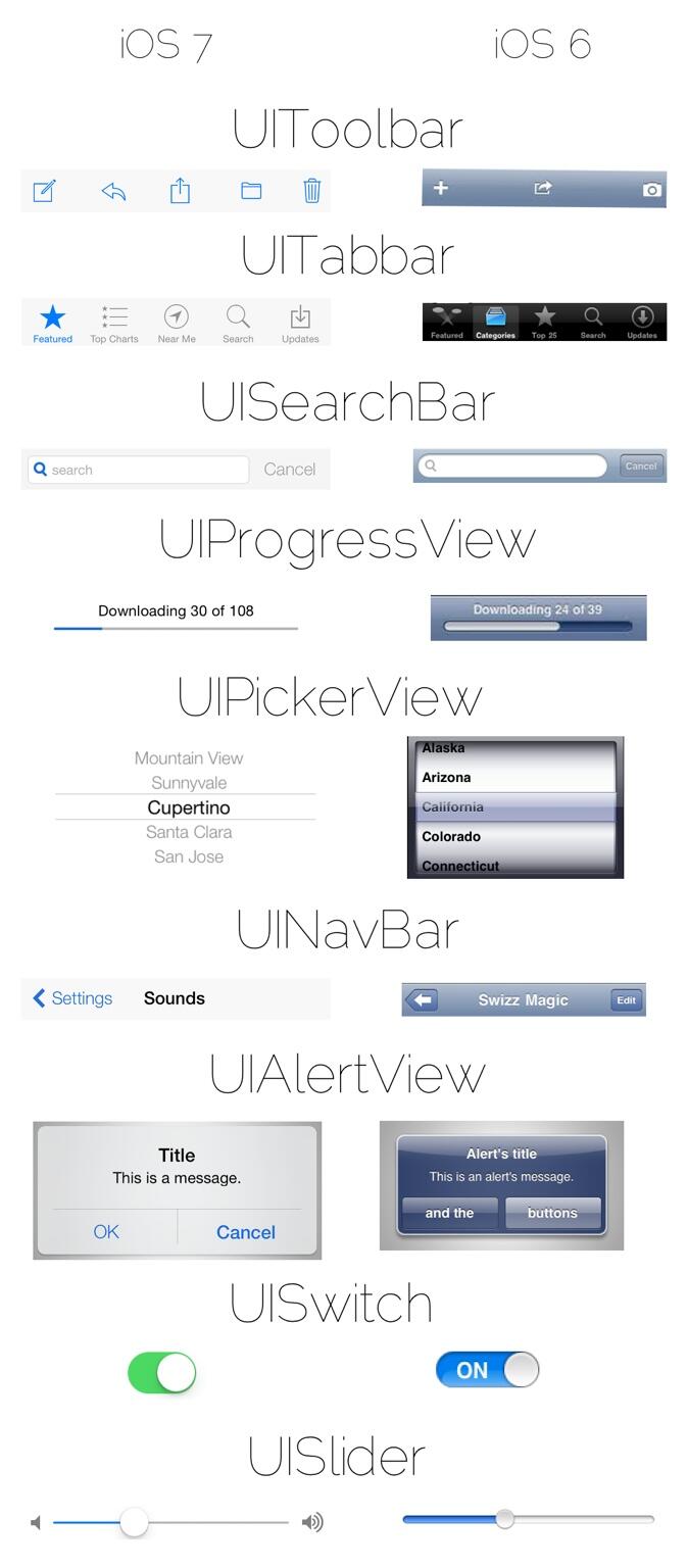
We already showed you an icon comparison of iOS 6 and iOS 7, but now developer Mpow has put together a comparison of the different UI elements in the operating systems.
Taking a look at the comparisons, you can really see how Apple stripped away a lot of the textures, gradients and gloss from iOS in favor of a more "flat" interface.
Follow us on :
Latest posts
 Leave a comment, read comments [1]
