Copy-Paste Proof of Concept

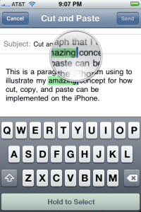
David Friedman writes in to let us know into the ‘This is how I think Apple should implement cut-and-paste’ ring. His idea is simple, intuitive, and doesn’t look to interfere with the current magnifying glass insertion point UI.
Here it is in a nutshell — when you have the magifying glass up, there’s a button you can press to toggle the various things you need for cut and paste — select, cut, copy, and paste. David recommends that the options shown would be contextual based on whether or not you have anything in your clipboard. When you’re in a text-entry field, that toggle button would appear in place of the space bar area at the bottom, while areas with text that lack text entry (like Safari) would need an unobtrusive button to appear when in the text-selection mode.
All in all, we like it.
- No convoluted finger gymnastics
- No trying to remember how many fingers you need to use for a given action
- Compatible with the current UI. In fact, it’s consistent and keeps the current text-selection metaphor of the UI intact. It just adds to it.
- Easily discoverable by all users
More screenshots:
via theiphoneblog and ironicsans
Follow us on :
 Leave a comment