Apple Redesigns Both Desktop and Mobile Websites [Screenshots]
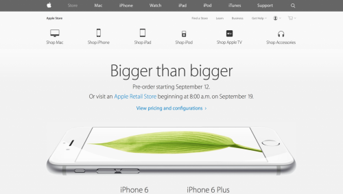
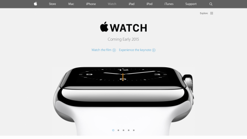
Immediately after the release of the 4.7-inch iPhone 6 and the 5.5-inch iPhone 6 Plus, the guys from Cupertino have redesigned its official website adding new look and making all the pages open faster on any device. Both desktop and mobile versions of the website got the new look, you can take a look yourself.
It should be noted, however, that the structure of the web page hasn’t been altered. What we see when entering Apple’s homepage is the same menu bar on top and the minimalistic design of the rest of the page. In general, we may assume that this is only a minor change that brings some simplifications, which affect the website load speed. Good news for those who have slow Internet speed, huh?
The new site features a very flat design with a simple gray menubar across the top. The page sections and footers have also been cleaned up and simplified.
Below you may take a look at some screenshots of the updated Apple website. What do you think about the new design?
[via iClarified]
Follow us on :


 Leave a comment