Here's How Apple Watch Companion App for iPhone Looks Like [Images]
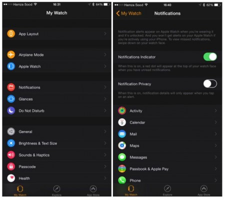
As you probably know, Apple’s iOS 8.2 can boast of one special app. This is the Apple Watch companion, which can be used to fine tune the wearable device and control it from the iPhone. So far, we haven’t seen the design and features of this useful app, however, thanks to iOS developer Hamza Sood we can now take a look at how the smartwatch companion looks like after one connects the Apple Watch to it.
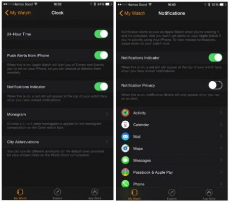
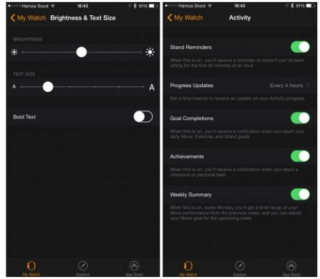
To be honest, the app looks quite similar to the Settings tab found in iOS. There are numerous sections responsible for app layout, notifications, sounds and many other things. You can take a look at the aforementioned app screenshots below.
As can be seen in the full gallery below, the interface is dark black, like the Activity app for fitness revealed yesterday, and includes all of the functionality we detailed earlier. Some interesting new settings, however, were revealed today, such as one for assigning a left or right wrist to the Watch, Handoff support, Haptic Strength, and volume levels.
One will get an opportunity to pre-order the Apple Watch starting April 10th. The prices for the device start from $350 for the cheapest aluminum version. The most expensive model made out of gold one will cost $4.000 or even more.
[via ]
Follow us on :


 Leave a comment