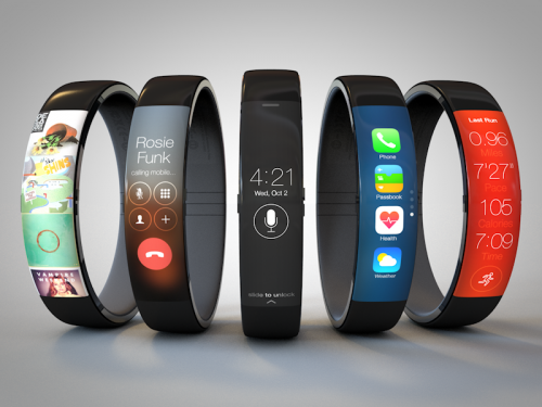
Todd Hamilton's iWatch Concept
Todd Hamilton has recently created another iWatch concept. It looks like a Nike Fuelband with iOS 7 user interface. And you know what? I like such combination and the whole concept more than the other ones.
Here’s what the author writes about his creation (via ):
I had some free time over the holidays so I decided to take a stab at the problem and create a more user friendly concept. I wanted to retain a slim form factor like the Fuelband and incorporate familiar UI components from iOS 7. It needed to feel natural on the wrist and look like something Apple would actually produce.
Do you like the new iWatch concept? Leave your comments below the article.
Follow us on :

 Leave a comment