Beautiful Gábor Balogh’s iWatch Concept - Photos
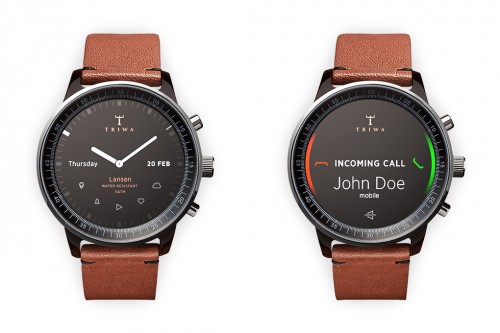
It seems that ahead of the iWatch launch, every designer thinks he’s obliged to create its own smartwatch concept. And while most of these concepts look ugly and impractical, there’re some that are really worth paying attention to. Gábor Balogh’s iWatch concept is one of such.
This designer created a device, which doesn’t actually resemble a smartwatch. It resembles a classic watch and that it the point.
As noted by ,
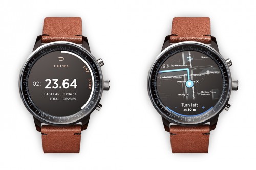
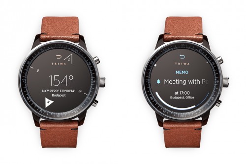
In an attempt to avoid obfuscation, Balogh's concept doesn't utilize a touchscreen or voice control. Instead, the interface uses the buttons and bezel found on most watches. The bezel is key to this interface. It can rotate to, for example, scroll through a long message or switch functions in an app, or be clicked to make a selection.
Below you may take a look at some other photos showing Balogh’s iWatch concept.
To be honest, I like the way this gadget looks immensely. And what about you?
Follow us on :


 Leave a comment